Case Study
Alimento Pizza Cafe
Alimento Pizza Cafe is a beloved local eatery in Collaroy Beach, serving Sicilian-inspired pizzas and hearty café fare. It was born from the coming together of two neighbourhood favourites - Alimento and Chillax - into one welcoming space, Chillax Meets Alimento. The result is a local favourite where you can enjoy fresh coffee and comforting meals in the morning, and handmade pizzas in the evening.
Why did they need us?
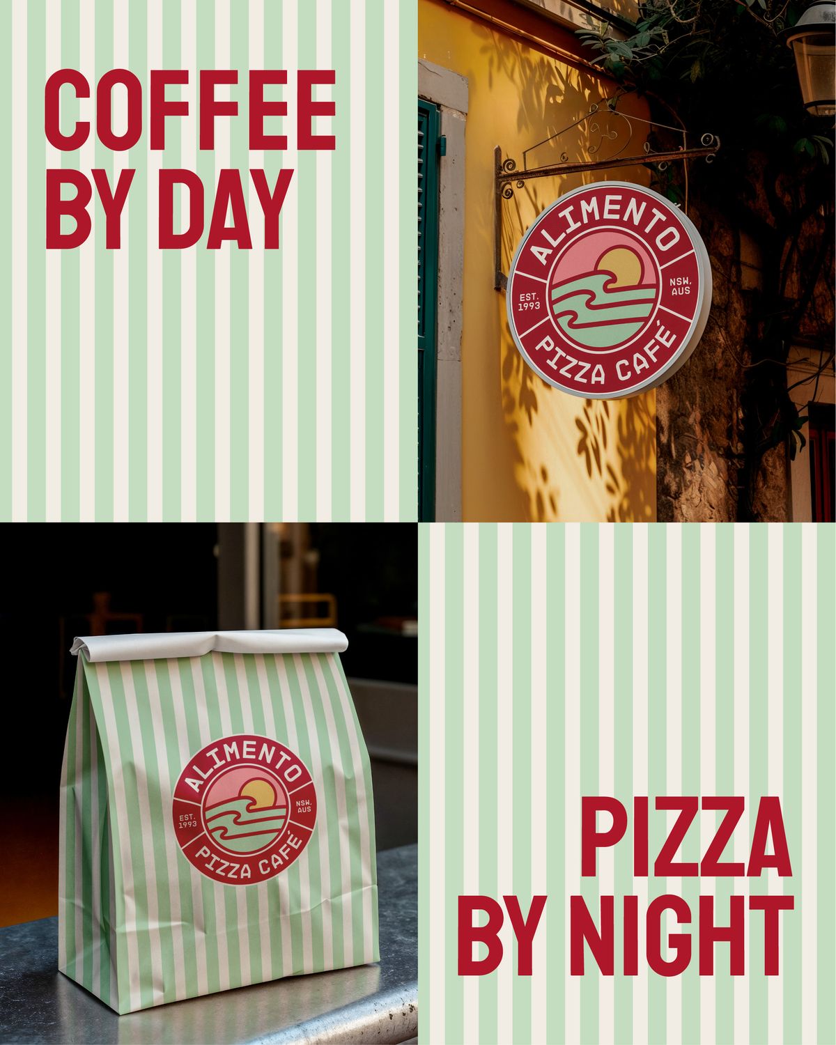
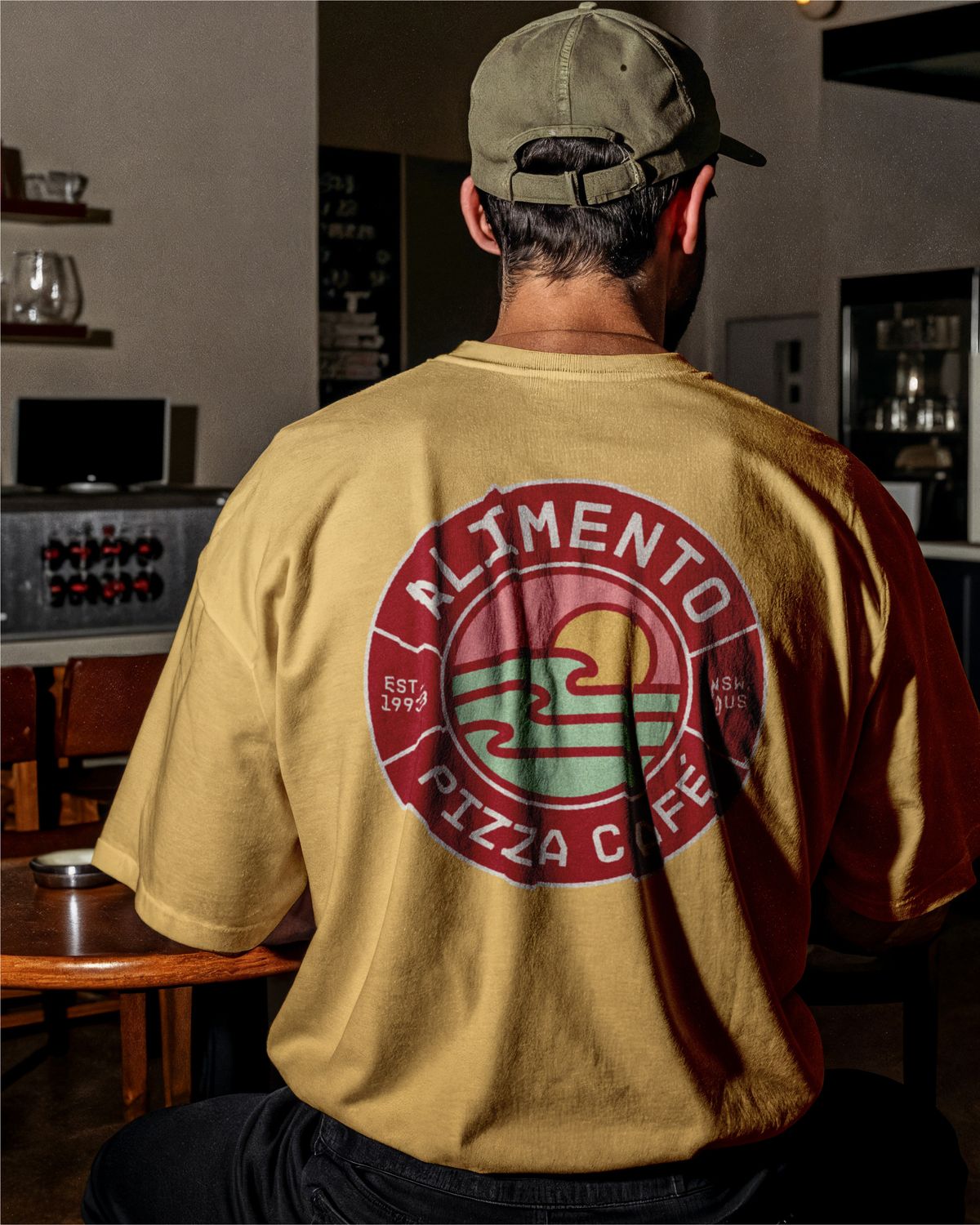
With two eateries merging and the goal of becoming a franchised restaurant with multiple locations, a new cohesive visual identity was needed - one that unified and paid tribute to both Alimento and Chillax under their new trading name. It had to be versatile across shop fit-outs, merchandise, coffee packaging and promotional material.
- Reflect the brand’s core values: community oriented, top notch quality and fresh, traditional and trusting, personal and welcoming
- Feel free yet timeless, capture the coastal Aussie lifestyle, and appeal to both loyal customers and new patrons
- Work across signage, packaging, merchandise, digital platforms and shop fitouts
The challenge
We needed to strike a balance between two different vibes - a touch of Italian heritage, but not so much that it wouldn’t suit a café during the day. It was important to establish a recognisable, memorable brand that embodies warmth, tradition and modernity, while staying true to its roots and established local charm, and staying distinct from fast food chains.
How did we do it?
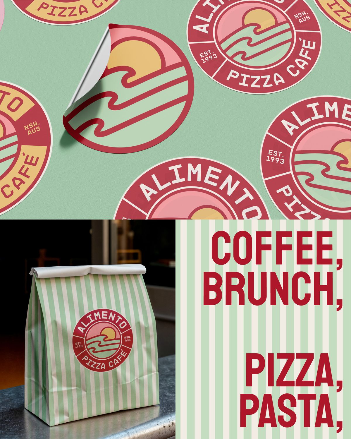
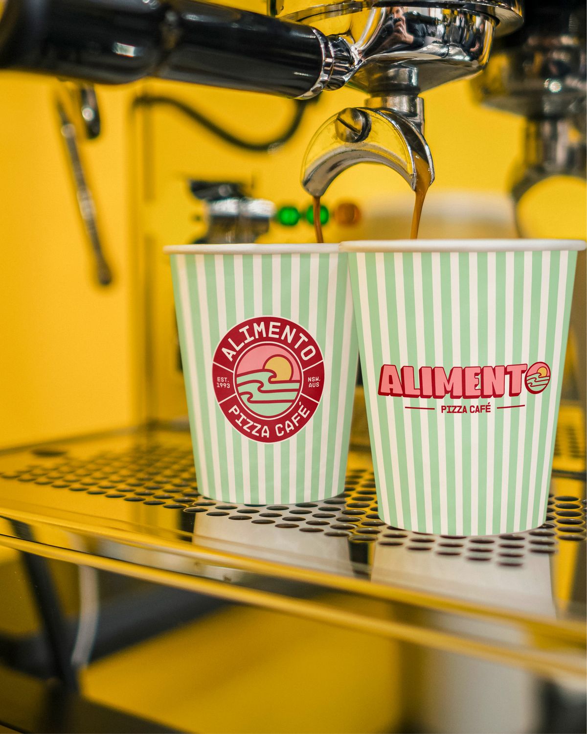
We began with three mood boards to explore the visual direction and align on the right look and feel. From there we developed initial logo concepts and refined them into a versatile suite - primary and secondary logos, a badge logo and a brand icon - designed for flexibility across everything from signage to merch.
To round out the identity we curated brand fonts and colours, and packaged everything into clear brand guidelines for consistent execution moving forward.
To help the team see the branding in action, we also provided 3D renders showing how it would come to life across the restaurant, packaging and more - ready to roll out across every touchpoint.
The new visual identity strikes a balance between boldness, playfulness and tradition - honouring the brand’s Italian roots while capturing the laid-back, coastal energy of Collaroy Beach. Designed to resonate with a new generation of diners, it introduces a modern edge without losing its heritage.
The curated colour palette blends warm, earthy tones with soft pastels, evoking comfort, authenticity and community. It reflects both the inviting atmosphere of the cafe and the relaxed beachside lifestyle around it.
At the heart of the brand is a simplified, abstract mark - a nod to Alimento’s origins, balancing the two vibes. Rounded forms, circular elements and soft lines create warmth and approachability, reinforcing Alimento as a home away from home.
The result
As the business grows, this visual identity is built to scale with it - keeping a strong connection to its beginnings while offering a timeless, easily recognisable identity across future locations.