Case Study
Asuka Japanese Kitchen
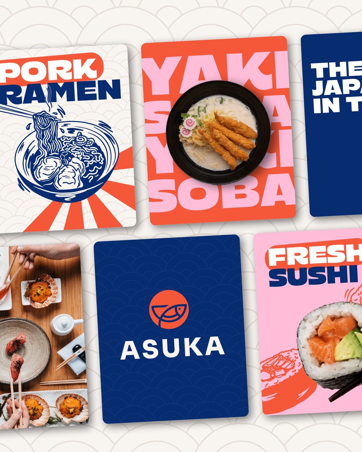
Asuka Japanese Kitchen is a fast-growing quick-service restaurant brand with four locations across Australia, known for fresh, authentic Japanese food served fast. We rebranded them - and a while later they came back for a second phase, which is where this project got interesting.
Why did they need us?
Asuka wanted to keep their original brand mark, but needed a full visual identity system to match where the business was heading. They were after something modern, edgy and culturally grounded - closer to bold, fast-moving global brands than traditional Japanese fine dining.
- Create a confident, edgy brand without compromising authenticity
- Appeal to a broad audience of 18–45: students, families, young professionals
- Visually and verbally stand out from other Japanese QSR restaurants
- Work across signage, packaging, digital, franchise assets and social media
The challenge
The existing identity felt like a high-end Japanese restaurant rather than a fast-paced QSR - too refined, too formal, and quietly signalling a price point the business wasn’t charging. The job was to keep the commitment to quality and authenticity visible while injecting a bold, rebellious energy that matched their ambitions in a crowded fast-casual market.
How did we do it?
We began with mood boards to open the conversation, exploring colour, tone and visual language so the client could see the possibilities rather than describe them. Then we ran a strategic workshop around the questions that actually decide a rebrand: which direction has long-term potential, what would resonate with the audience rather than personal taste, and how do you want people to feel when they come across Asuka.
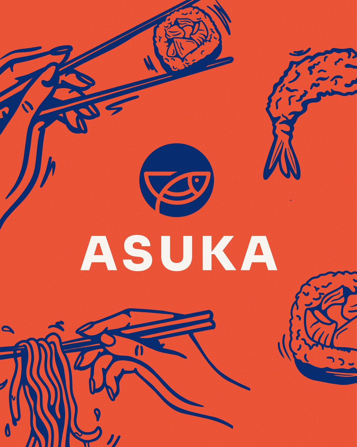
From there we fused modern boldness with cultural nuance. A rich indigo nods to Japanese heritage, balanced by warm salmon and soft cream drawn from sushi and sashimi. A chunky, slightly edgy sans-serif holds up on signage and packaging. Clean geometric icons and subtle patterns inspired by traditional waves and sashimi textures gave the system depth without clutter.
Then they came back
A rebrand that works tends to reveal what’s missing next. Asuka returned asking for a custom illustration system - something ownable that could carry the brand across packaging, menus and social without leaning on photography every time.
We presented two directions. The first was character-led and playful: exaggerated forms, mascot elements, and a flying bird carrying chopsticks - a nod to the name itself, which reads as flying bird. Charming, and genuinely tempting.
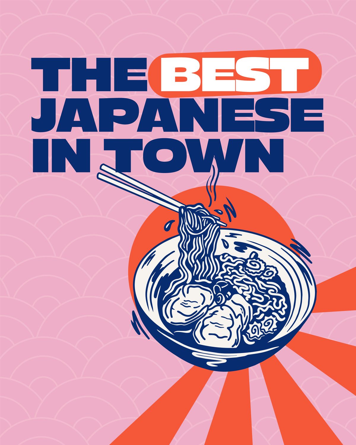
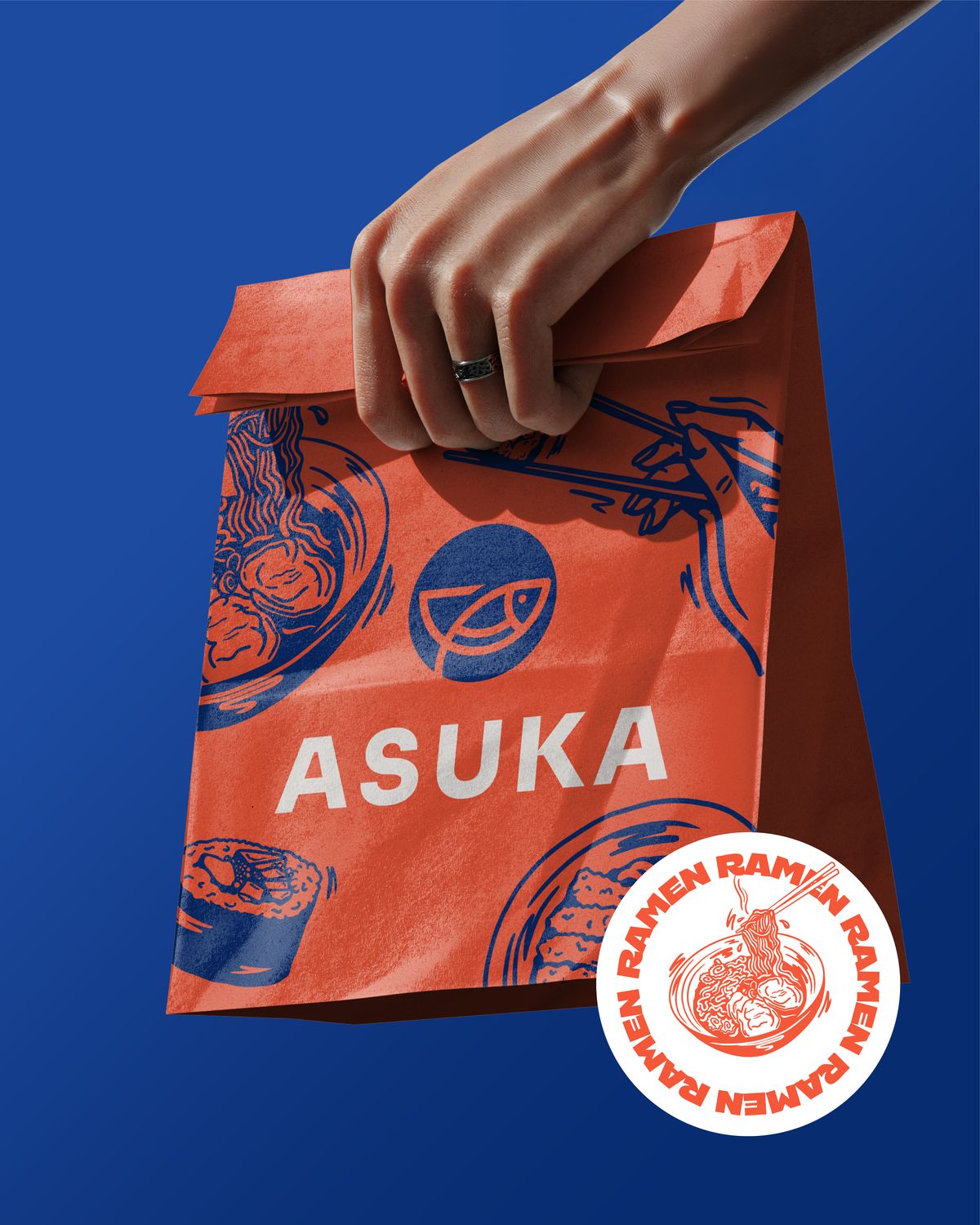
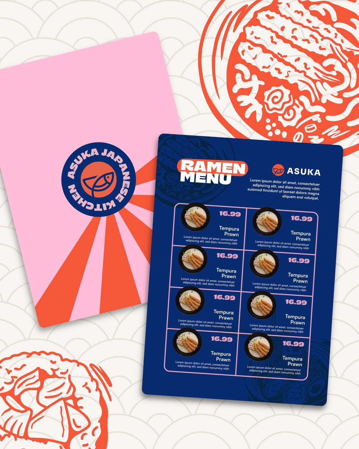
They chose the second, and they were right to. It takes a graphic interpretation of Japanese illustration - simplified forms, hand-drawn line work, flat blocks of traditional motifs like waves, clouds and sunbursts, with stamp-like elements and a poster sensibility. Illustrative, but still premium.
Why did we design it this way?
The mascot direction would have been the safer crowd-pleaser, but it would have pulled Asuka towards novelty - and novelty ages badly on a shopfront you’ll still be looking at in five years. The graphic direction does the harder thing: it reads as considered rather than cute, and it scales from a sticker to a wall.
Hand-drawn line work keeps it human, so the brand never feels corporate. Flat colour blocking keeps it cheap and clean to print across packaging. And because the motifs are drawn rather than photographed, Asuka owns them outright - nothing in the system can be bought by a competitor from a stock library.
The illustrations also forced a useful revision. Once the line work existed, salmon was doing more work than the original palette allowed for, so we promoted it into the primary palette alongside traditional blue and rice white, and moved ginger pink into a supporting role.
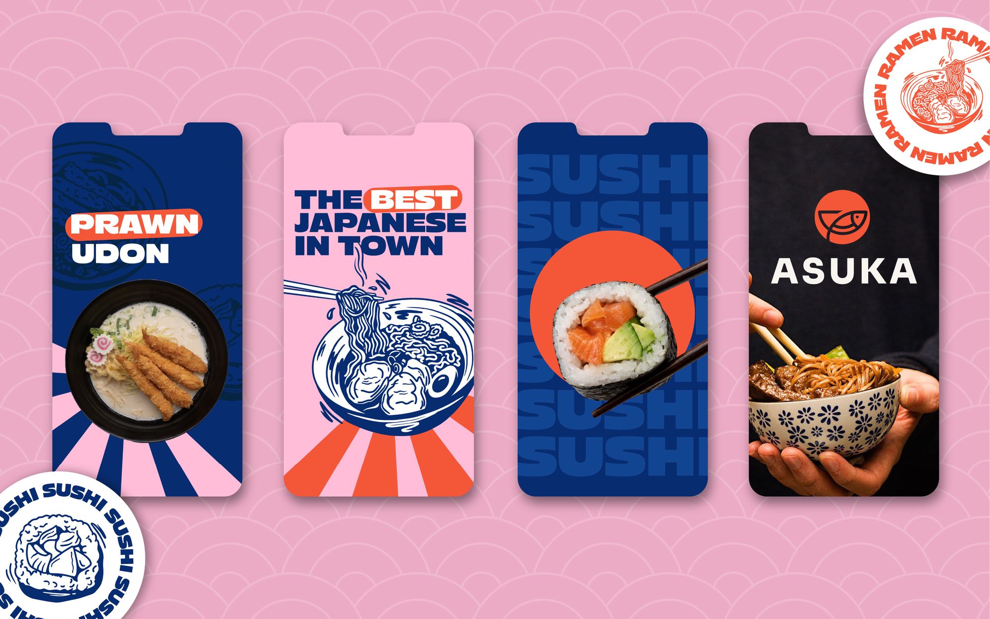
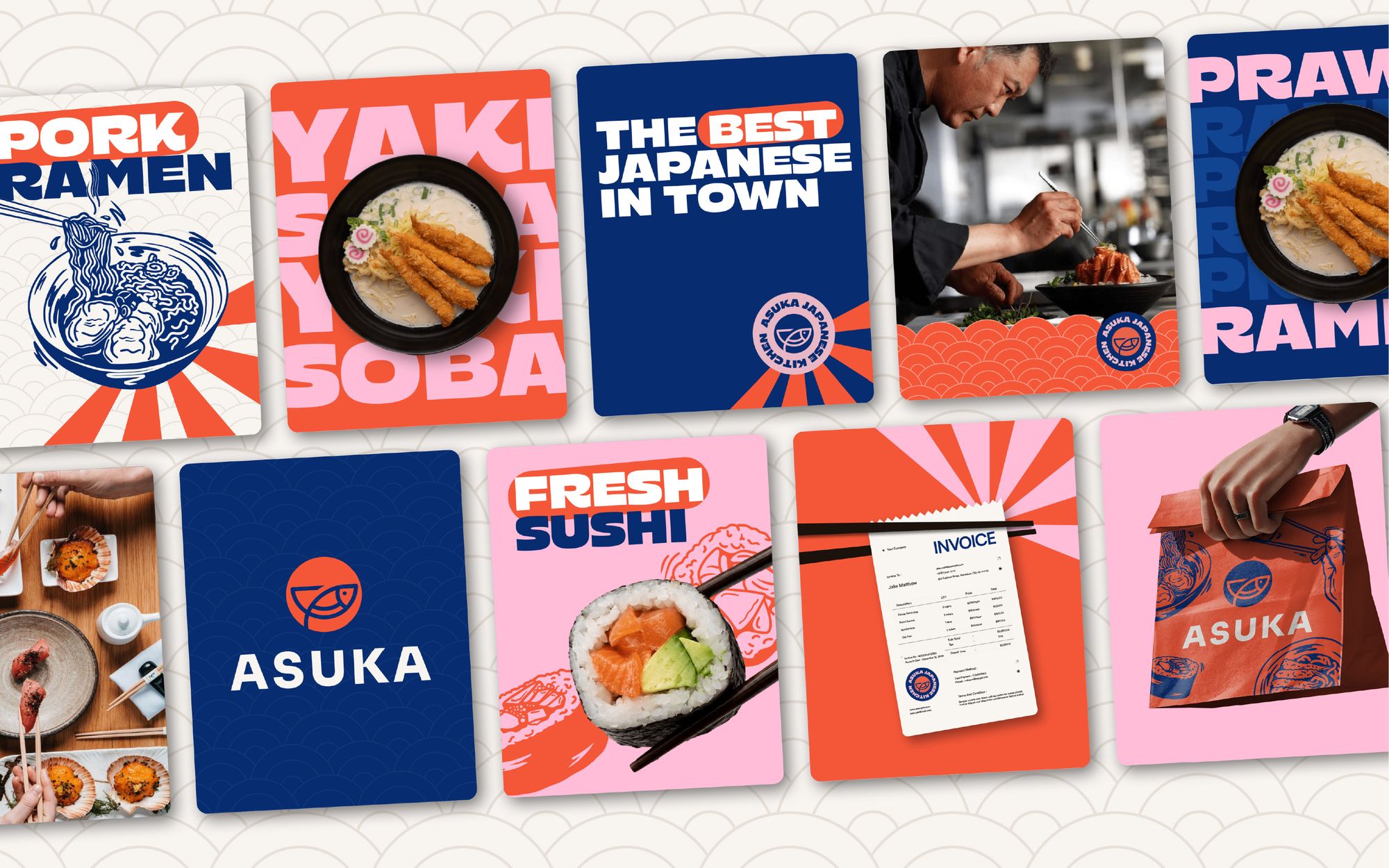
A full responsive logo suite - primary, secondary, brandmark and badge - alongside a revised colour palette, updated wordmark and brand typography.
A custom illustration library built on hand-drawn line work and traditional motifs, owned outright by the brand and applicable from a sticker to a shopfront.
Iconography, patterns, textures and a template system for social, menus and packaging, so the team can produce on-brand collateral without a designer each time.
The result
The rebrand shifted Asuka from a fine-dining impression to a confident, contemporary QSR brand positioned for franchise growth. The illustration system that followed gave it something rarer - a visual language that belongs to Asuka alone, and gets more recognisable the more it’s used.
The best measure of the first phase is that there was a second one.