Case Study
Burly Luggage
Burly Luggage is a lifestyle brand committed to sustainability, producing long-lasting luggage for the modern adventurer. They blend durability with affordability, offering reliable products for a broad, inclusive audience.
“The team were awesome to work with and guided us throughout the project. Would definitely recommend Verve11 to anyone that needs design work.”
Why did they need us?
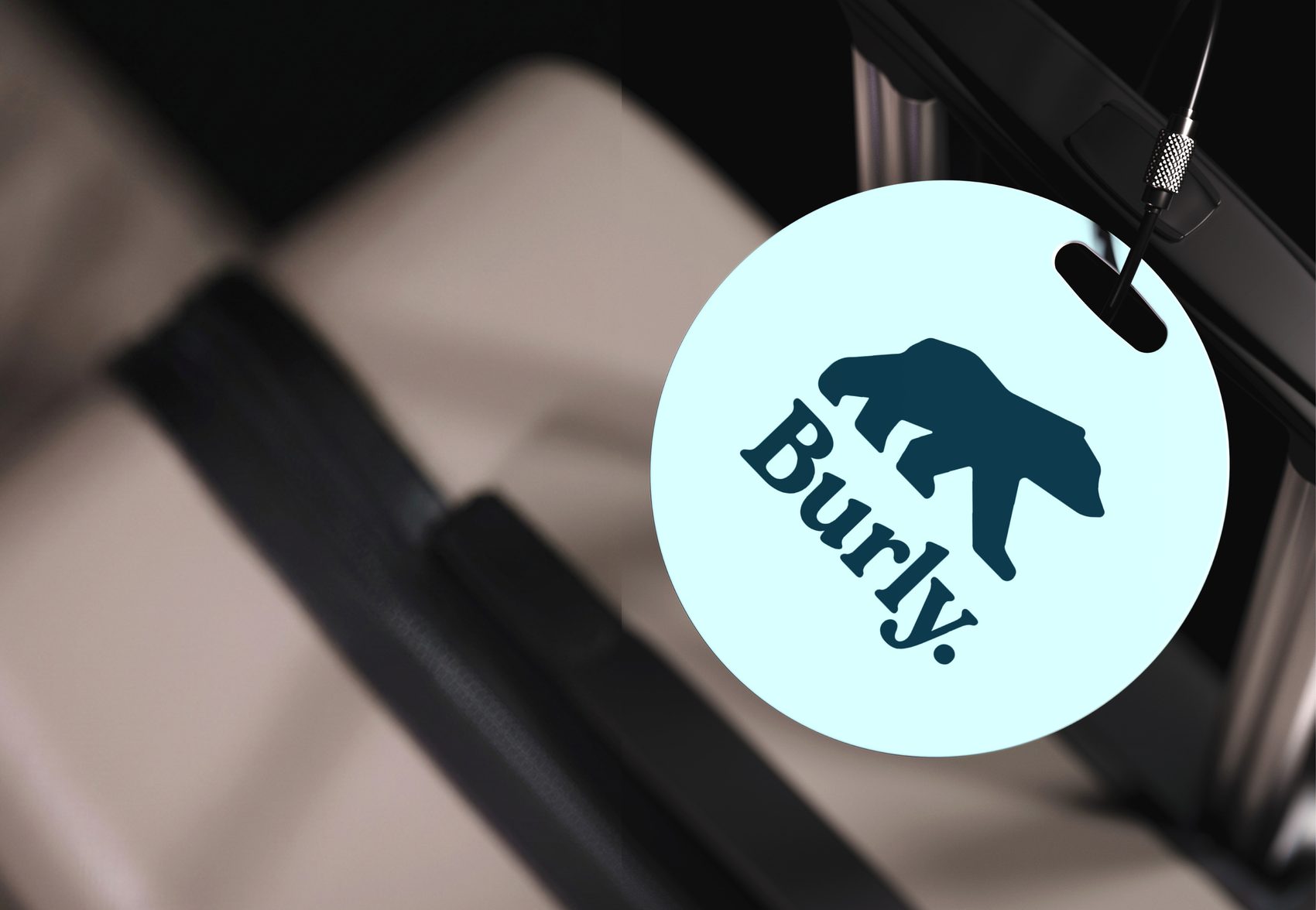
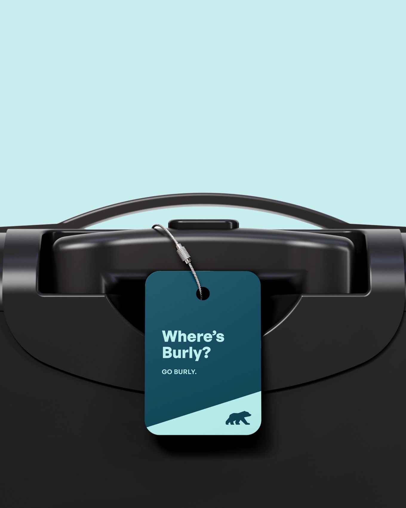
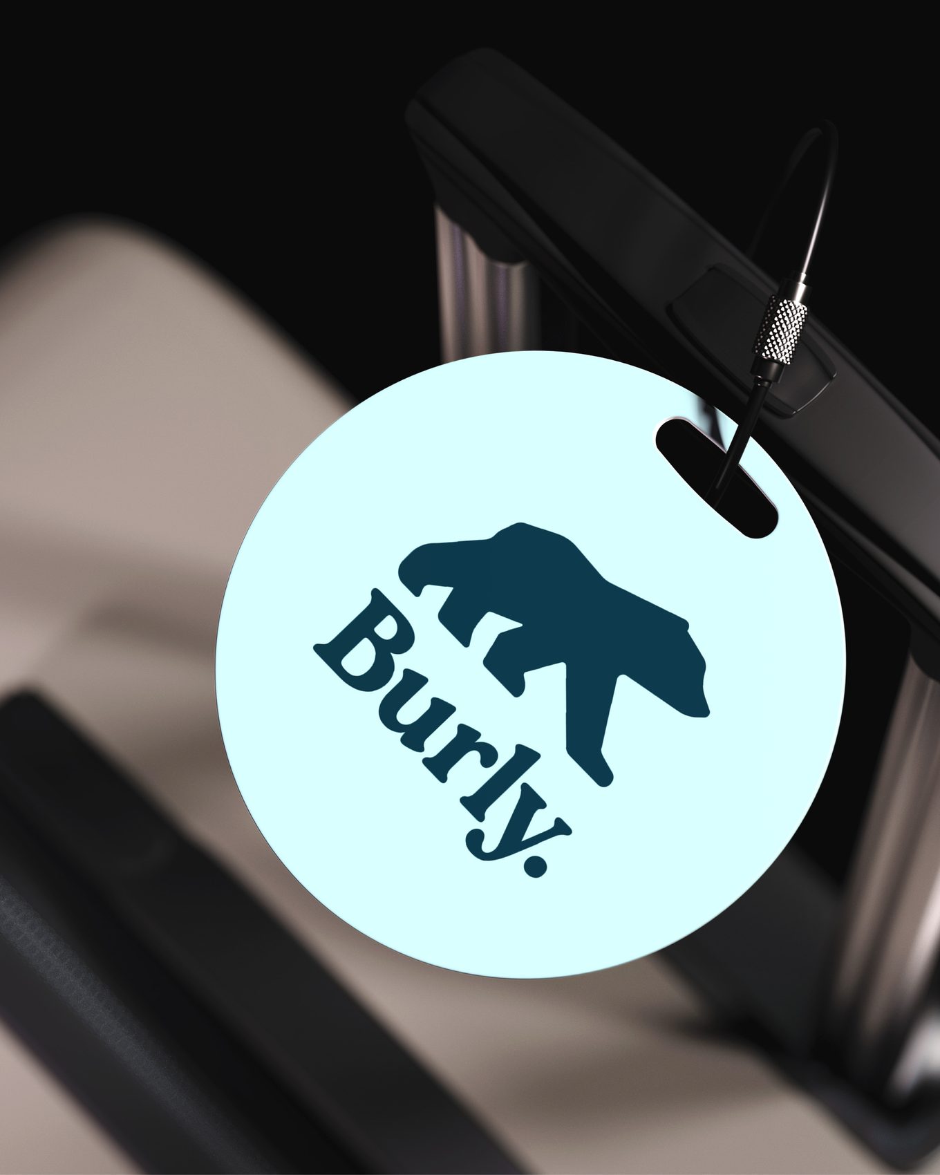
Burly came to us for a modern, bold, memorable brand mark that could work alongside their existing wordmark. Beyond aesthetics, they needed a responsive suite that could adapt across luggage, apparel, packaging and digital.
- Reflect the brand’s core values: reliability, affordability, accessibility and sustainability
- Maintain premium quality while staying approachable and inclusive
- Translate clearly when pressed into leather, avoiding thin lines or intricate detail that doesn’t emboss well
- Capture a personality that feels effortlessly cool, functional and traveller-friendly
The challenge
Burly’s original logo was a single wordmark, and it wasn’t translating onto their core products - particularly embossed surfaces like leather tags. They needed a distinctive icon that could live independently, especially where the full wordmark wouldn’t work. Strong and adaptable, without losing the recognition they had already built.
How did we do it?
The first concept began as a hand-drawn sketch, keeping the process grounded and human. It’s our way of connecting with a brand from the very beginning. From there we developed three digital variations, giving clear visual directions and room to choose.
After collaborative feedback and refinement, we expanded the chosen direction into a comprehensive logo suite - taking the brand from a single mark to a versatile system of five to six responsive variations. Future-proofed for consistency across formats, and for product and platform expansion.
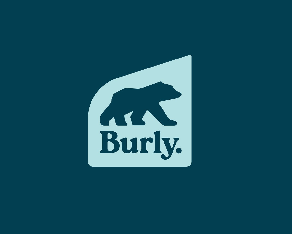
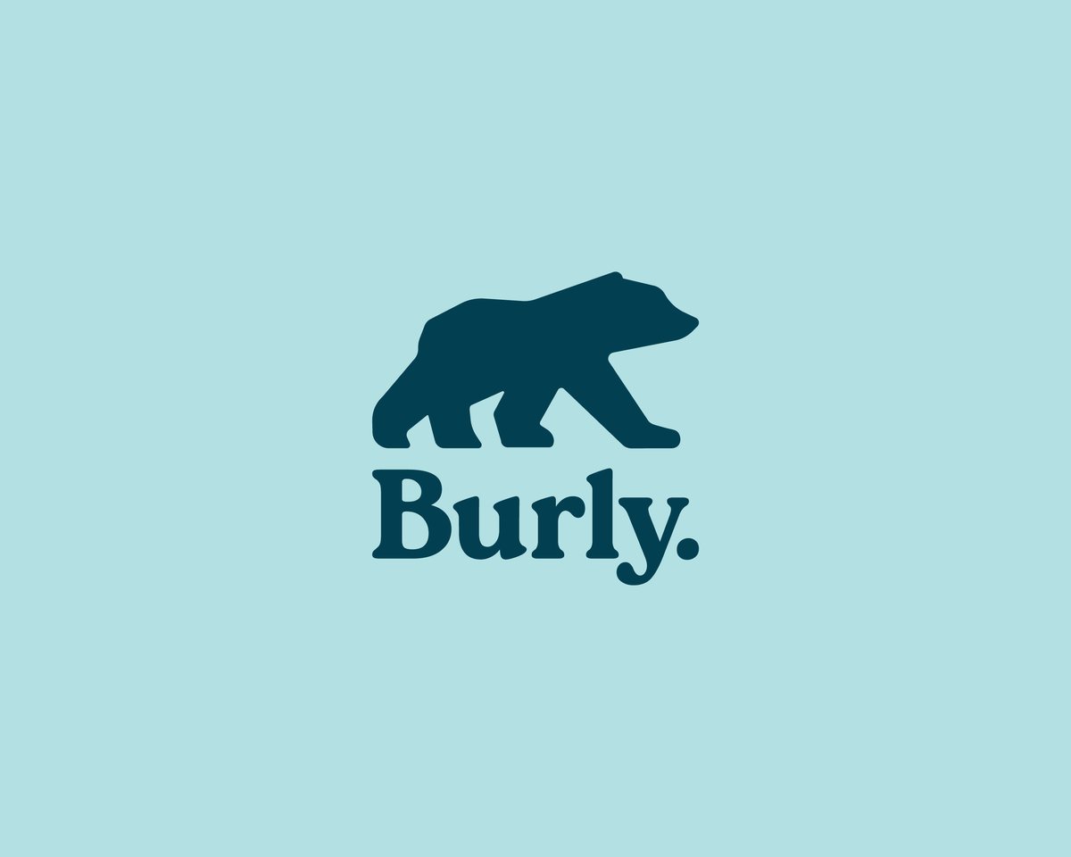
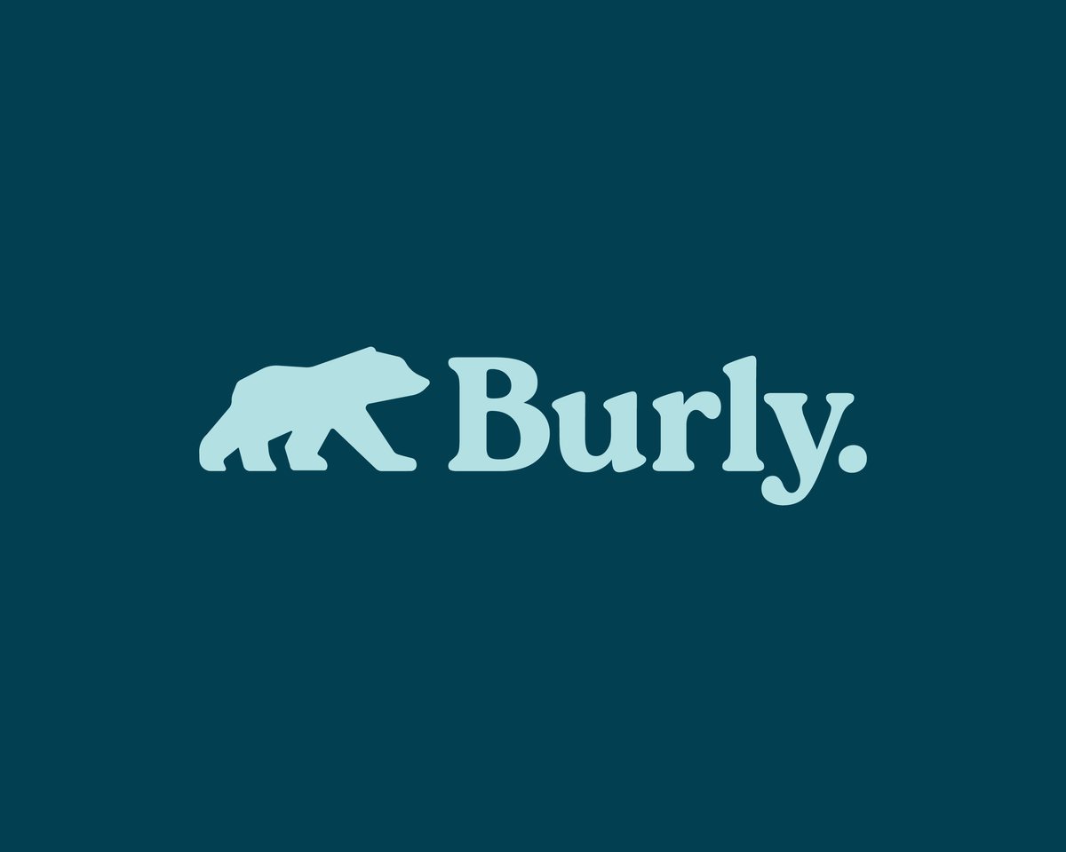
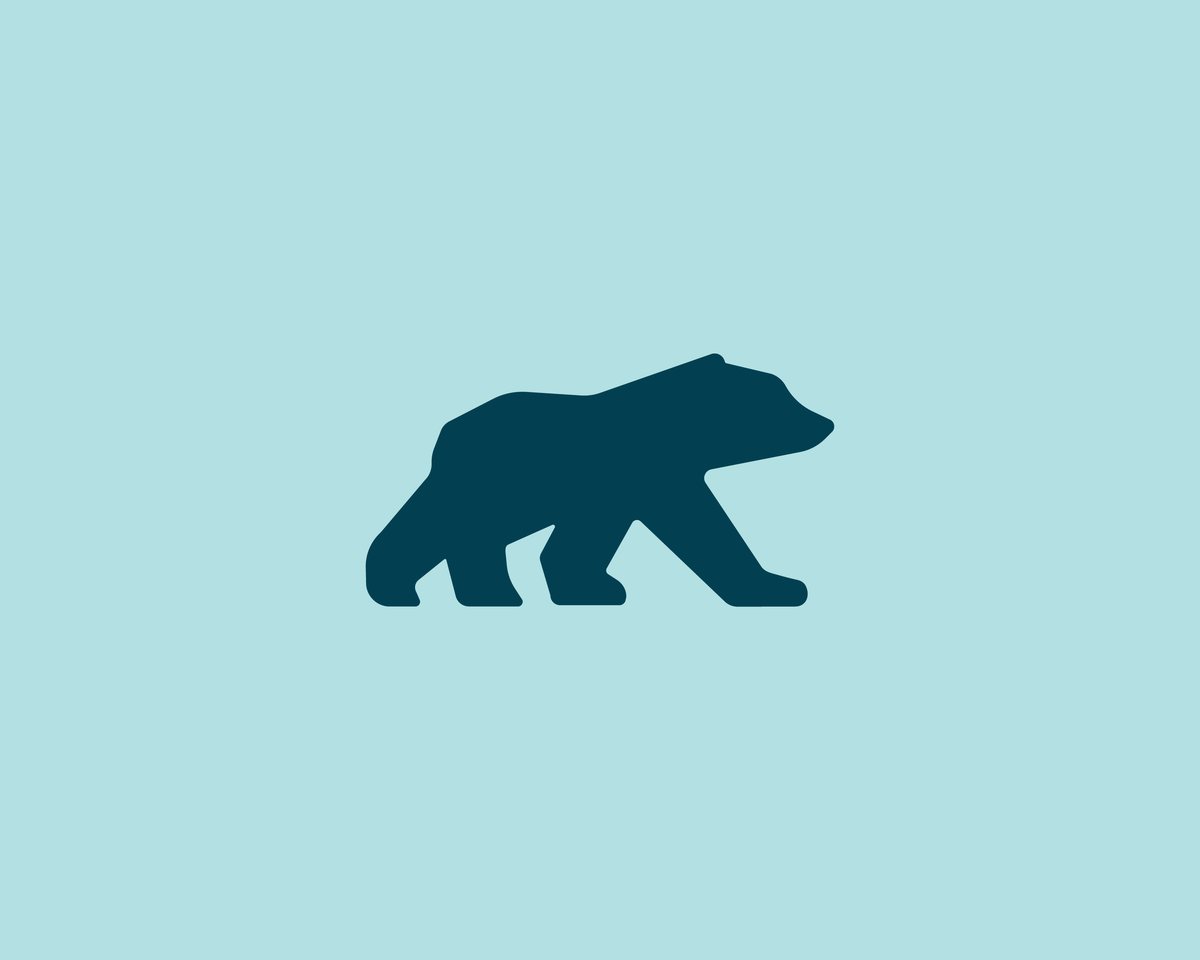
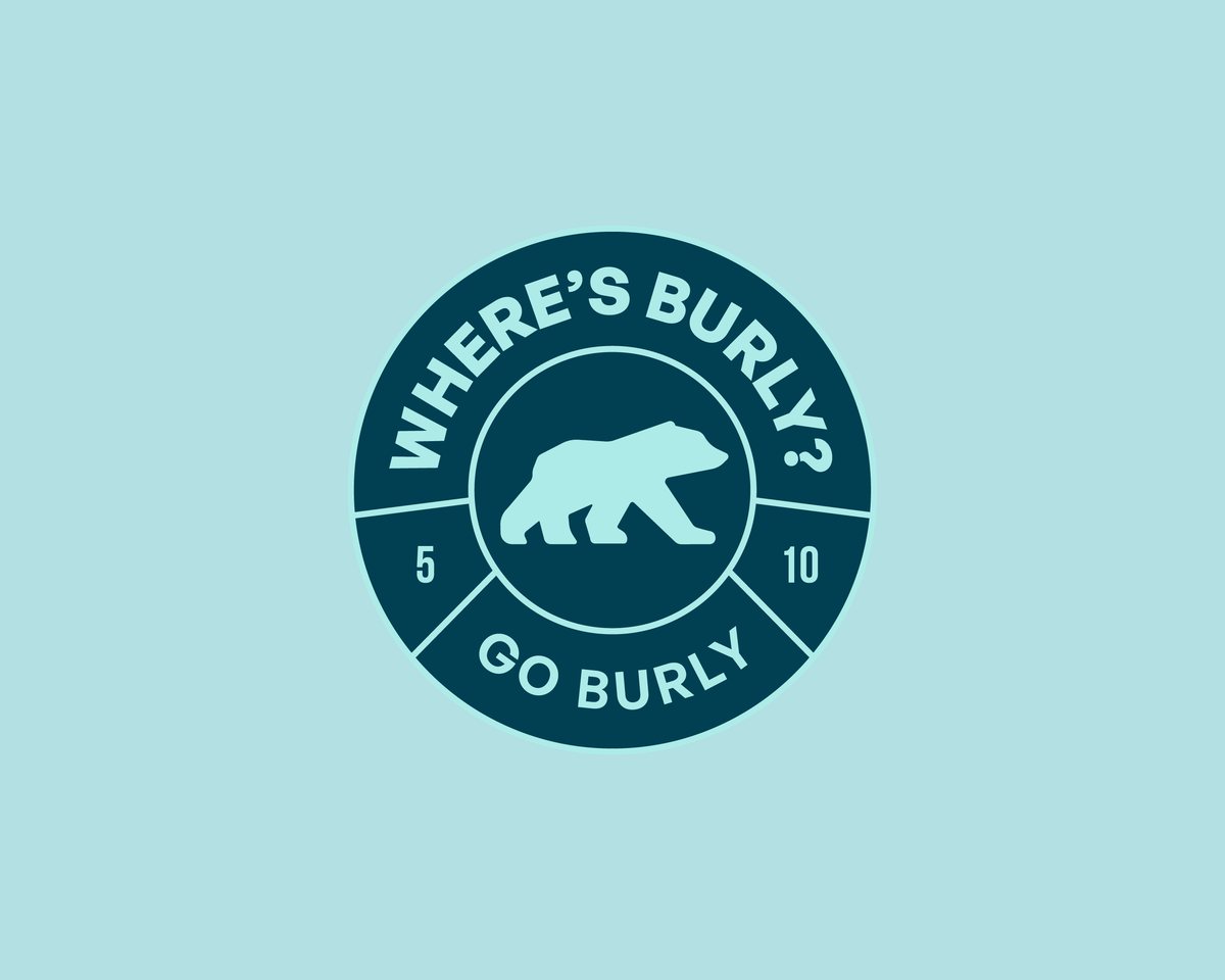
We designed every element with practicality in mind, ensuring clarity and strength when pressed into leather or embroidered on fabric.
The versatile suite means there is always a version that fits, no matter the surface, scale or product.
The process also educated the client on the value of scalable brand systems, avoiding costly redesigns as the brand grows.
Why did we design it this way?
The core icon is a stylised polar bear - a bold, structured form that embodies strength, resilience and reliability. Semi-straight edges speak to toughness, while rounded corners keep it friendly.
The bear stands forward-facing, angled slightly upward to convey confidence, movement and aspiration. That upward motion is echoed in the angles of the ‘u’ and ‘l’ in the wordmark. Burly the polar bear is your travel companion, and has your back wherever you go.
A subtle compass needle in the top-right corner nods to exploration and direction, aligning with Burly’s adventurous spirit.
The result
With this responsive logo suite, Burly Luggage now has a flexible, functional and future-ready visual identity. The mark is visually distinctive across all luggage and apparel, and the system ensures long-term brand durability.