Case Study
TM Track Club
TM Track Club is a high-performance sprint coaching business in New Zealand, founded by James three years ago to bring structured, research-backed training to elite athletes and dedicated individuals. The name comes from a personal sports nickname - the business is grounded in lived experience rather than something invented for market.
Why did they need us?
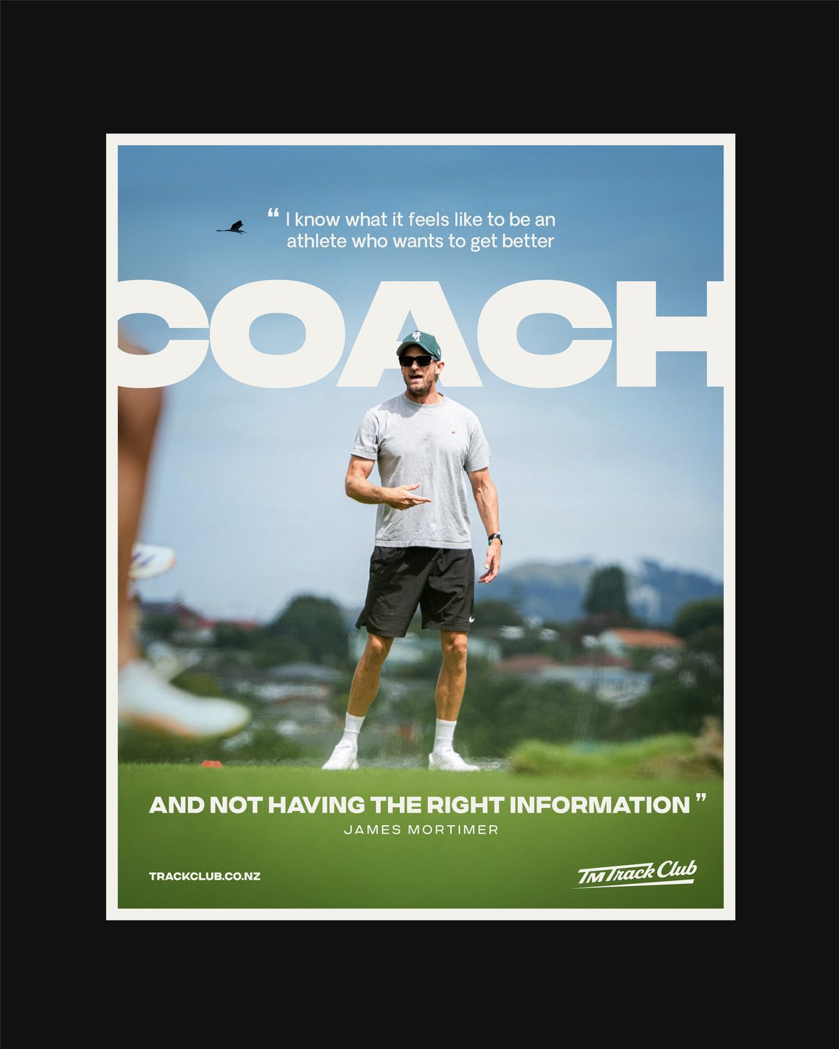
James had already built the reputation - first on Google for sprint coaching in New Zealand, working with nationally and internationally ranked athletes and professional teams. What he didn’t have was a brand that looked like it. He needed an identity that communicated the standard of the coaching before anyone read a word about it, and one that could carry a business built to grow past one-to-one sessions.
- Communicate credibility, professionalism and research-backed quality at a glance
- Appeal to elite athletes and everyday individuals alike, across different budgets
- Position James as a leading authority in sprint coaching in New Zealand
- Support a scalable model - digital programs, downloadable content and guided video
- Work across social, digital platforms and coaching collateral
The challenge
Sports coaching brands tend to sit at one extreme or the other - elite and unapproachable, or accessible and unconvincing. TM Track Club needed both at once. The identity had to read as high-performance and evidence-based without feeling exclusive or out of reach, because the same brand has to convince a nationally ranked sprinter and a teenager buying their first downloadable program. Both need to believe it was built for them.
How did we do it?
We began with a brand discovery questionnaire to get underneath the business - where it came from, where it’s going, and how James wanted athletes to feel the moment they found it. His answer was the useful one: this is what I’ve been looking for.
From there we developed two creative directions as mood boards rather than finished designs. The first positioned the club as a modular, data-driven coaching platform, with a layout system built to scale across content. The second positioned it as a culture-led performance brand - editorial, graphic, something athletes feel part of rather than subscribe to.
We asked James to judge them through his ideal athlete’s eyes rather than his own taste. The chosen direction kept the black, red and white he had instinctively reached for, and gave it the editorial discipline and breathing room of the second board.
Why did we design it this way?
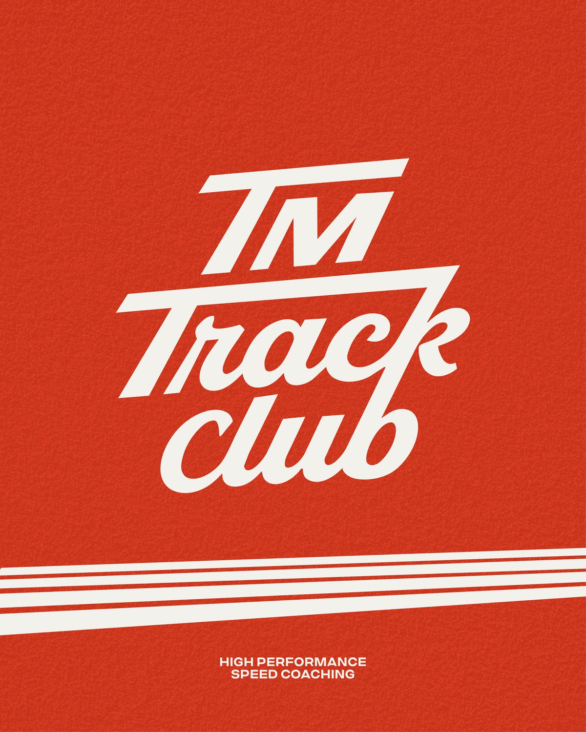
The logo. A sleek wordmark, rounded enough to stay friendly but bold enough to make a statement. The tops of both capital T’s resemble track lanes, and are reused as a brand asset across collateral. The forward lean mirrors the transition out of the blocks into an upright sprint - movement built into the letterforms rather than added on top.
Colour. Red, white and black carry equal weight at 25% each, with a secondary palette and a gold accent used sparingly. Black and red never sit on top of each other. That one rule keeps every application sharp and stops the palette going muddy in the hands of someone who isn’t a designer.
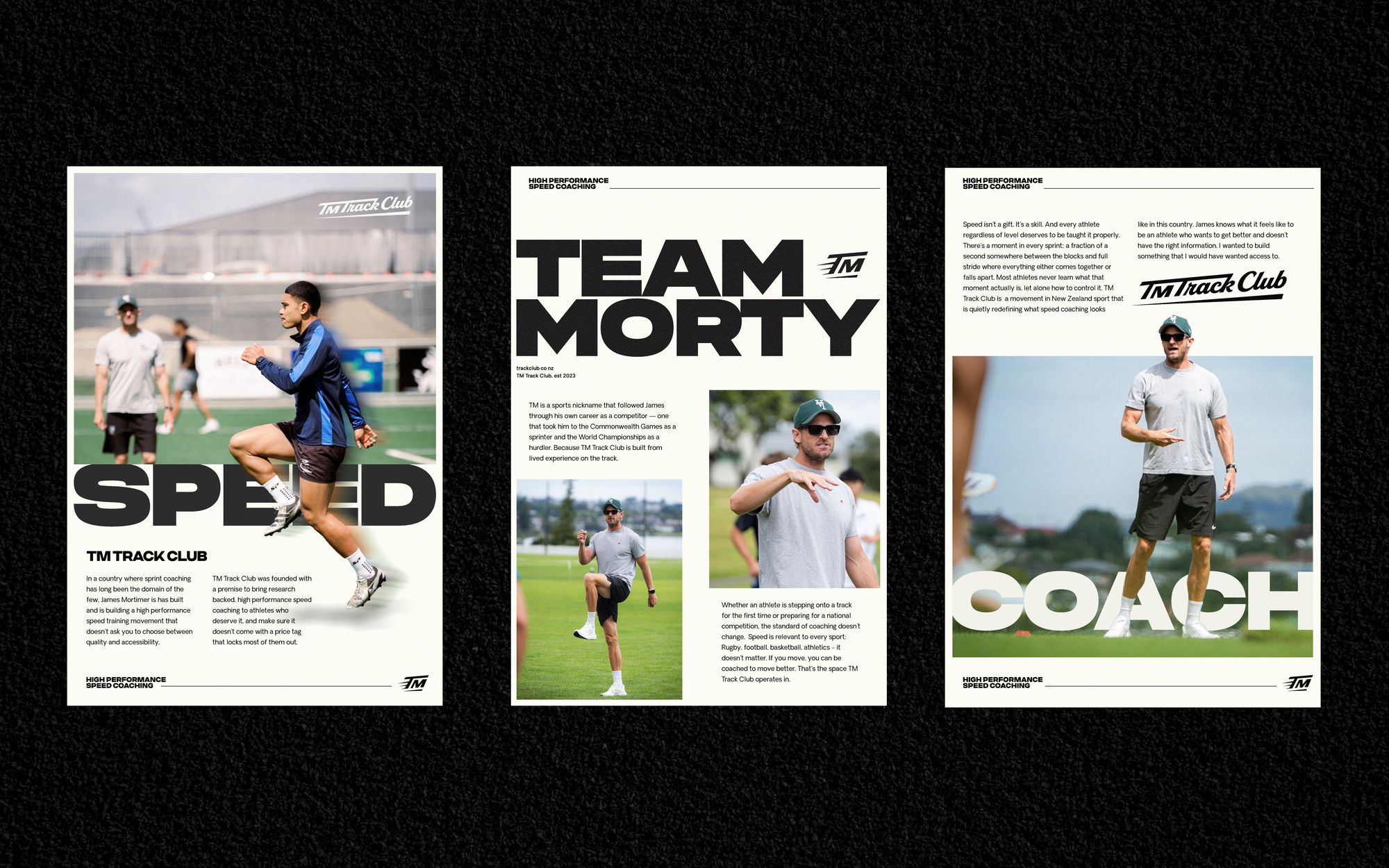
Typography. Phonk for statement words, never more than two at a time. Criteria CF Bold for headings and buttons. Oakes Grotesk for subheadings and paragraphs, chosen to stay legible at the sizes coaching content actually gets read at - on a phone, at the track.
Assets and texture. Minimal athletics tracks and sprinting figures drawn from clean lines, used large and cropped rather than whole, so they read as graphic devices instead of clip art. A subtle texture referencing the rubber of a track surface adds depth without noise.
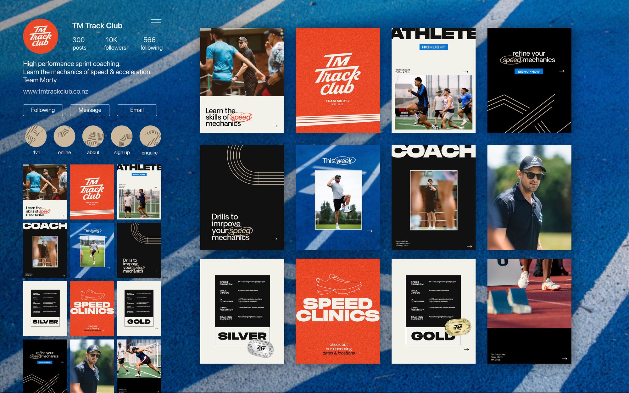
Elite without exclusive. Structure, discipline and a clear hierarchy do the work of signalling quality, so the brand reads as high-performance without psychologically pricing anyone out before they’ve seen a price.
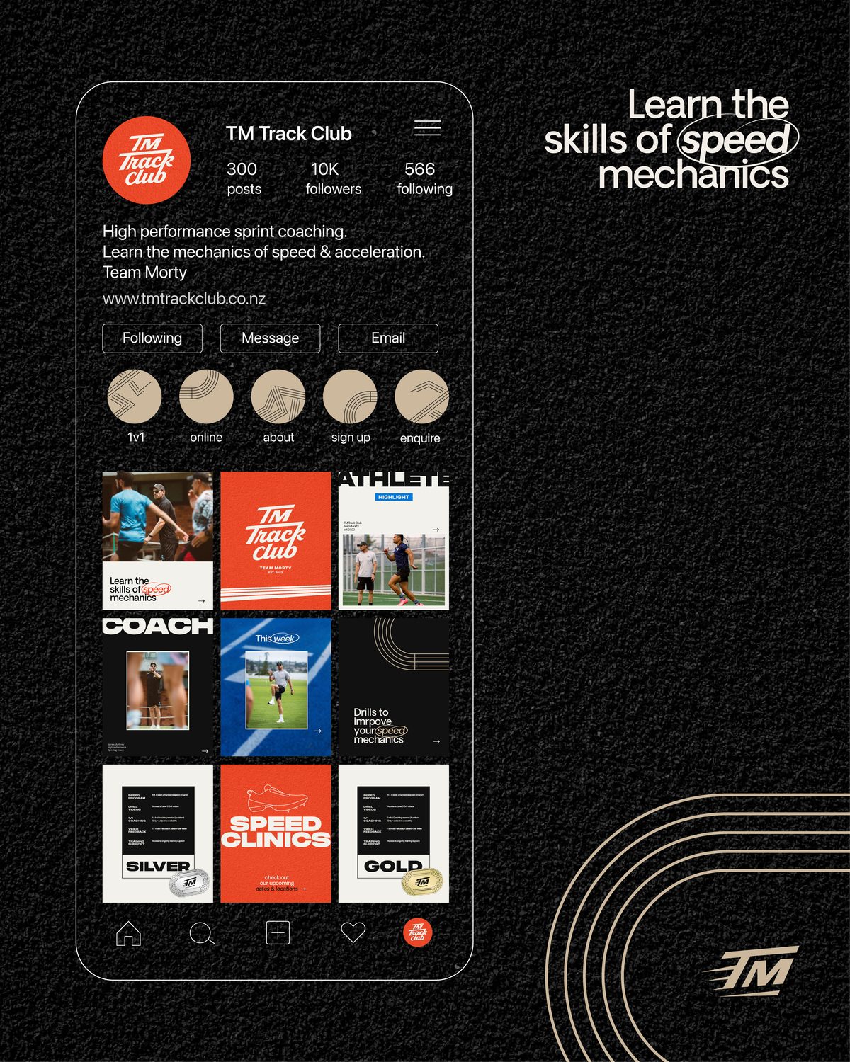
Built to scale. The type hierarchy and asset system mean James can produce programs, guides and social content that stay on brand without a designer in the loop - essential for a business whose growth depends on digital product.
Ownable in a crowded market. The track lanes in the T’s and the cropped sprinting figures give the club something recognisable and specific to it, rather than the generic athletic styling most coaching brands settle for.
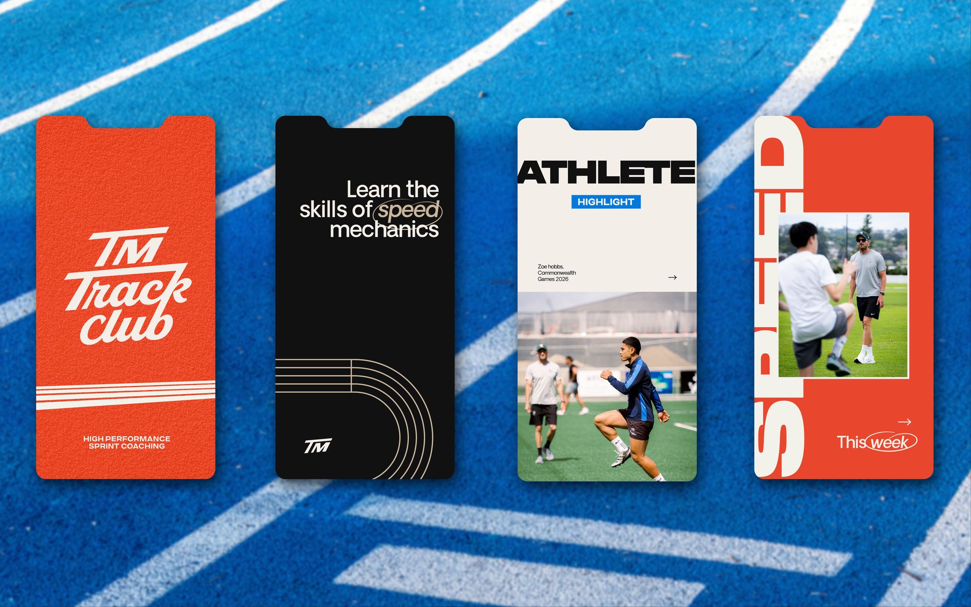
The result
TM Track Club now has an identity that matches the standard of the coaching behind it. It positions James as an authority in sprint coaching without putting distance between him and the athletes he wants to reach, and it is built to stretch - into more sports, more coaches, and a catalogue of digital programs that can carry the brand on their own.