Case Study
WTF Journals
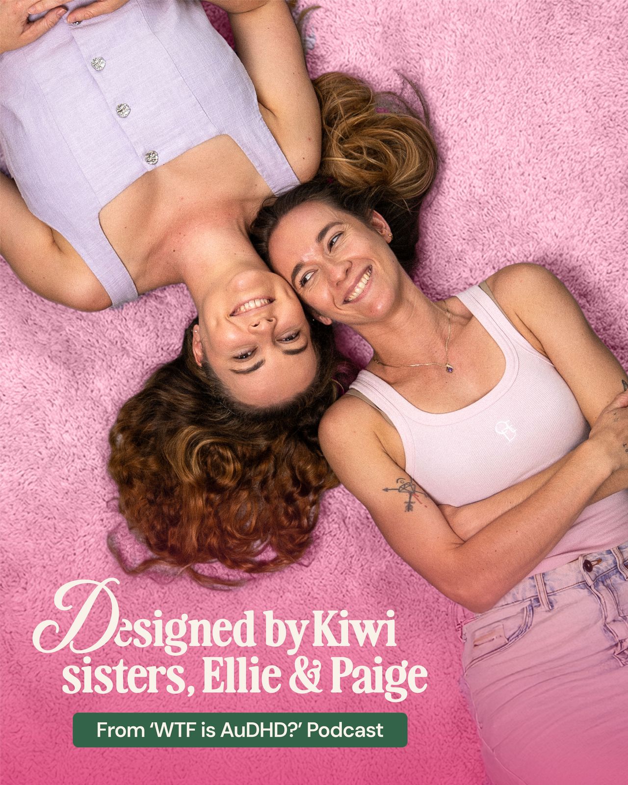
WTF Journals is a customisable, undated, refillable vegan leather journal system made by Kiwi sisters Ellie and Paige. It started with a question they put to their own audience - what’s the biggest reason you stop using journals? - and became a product designed in public, with the people who would end up buying it.
Why did they need us?
The product had been built in the open over months, shaped by hundreds of replies from people who had given up on planners. What it didn’t have was a brand that matched that effort - something that read as a considered product business rather than a spin-off, and that could carry a pre-order launch, a founding member programme, and everything after it.
- Stand alone as a product brand while staying recognisable to the community already invested
- Look and feel like a premium product, not merch
- Signal a difference that is structural rather than decorative - undated, flexible, no guilt
- Carry a pre-order launch, founding member perks and an ongoing e-commerce business
- Hand over a system the sisters can run themselves, drop after drop
The challenge
Traditional planners sell one promise and then punish you for missing it. Dated pages that turn a skipped week into evidence of failure. Rigid templates. A tone that quietly equates consistency with worth. The audience had already said all of this out loud - that dates make them feel like they’ve wasted something, that rigid layouts stop them before they start. So the identity had to signal this one is built differently before anyone read a single feature, while staying warm rather than clinical, and playful without talking down to a grown-up audience who get patronised constantly.
How did we do it?
We built the brand the same way they built the product: in public, with the audience in the room. When it came to the final palette, two directions went out to the community and people were asked to vote. Deep forest green with pink won.
That wasn’t a gimmick, it was the positioning made real. A product sold as designed for you, by you cannot credibly be branded behind closed doors.
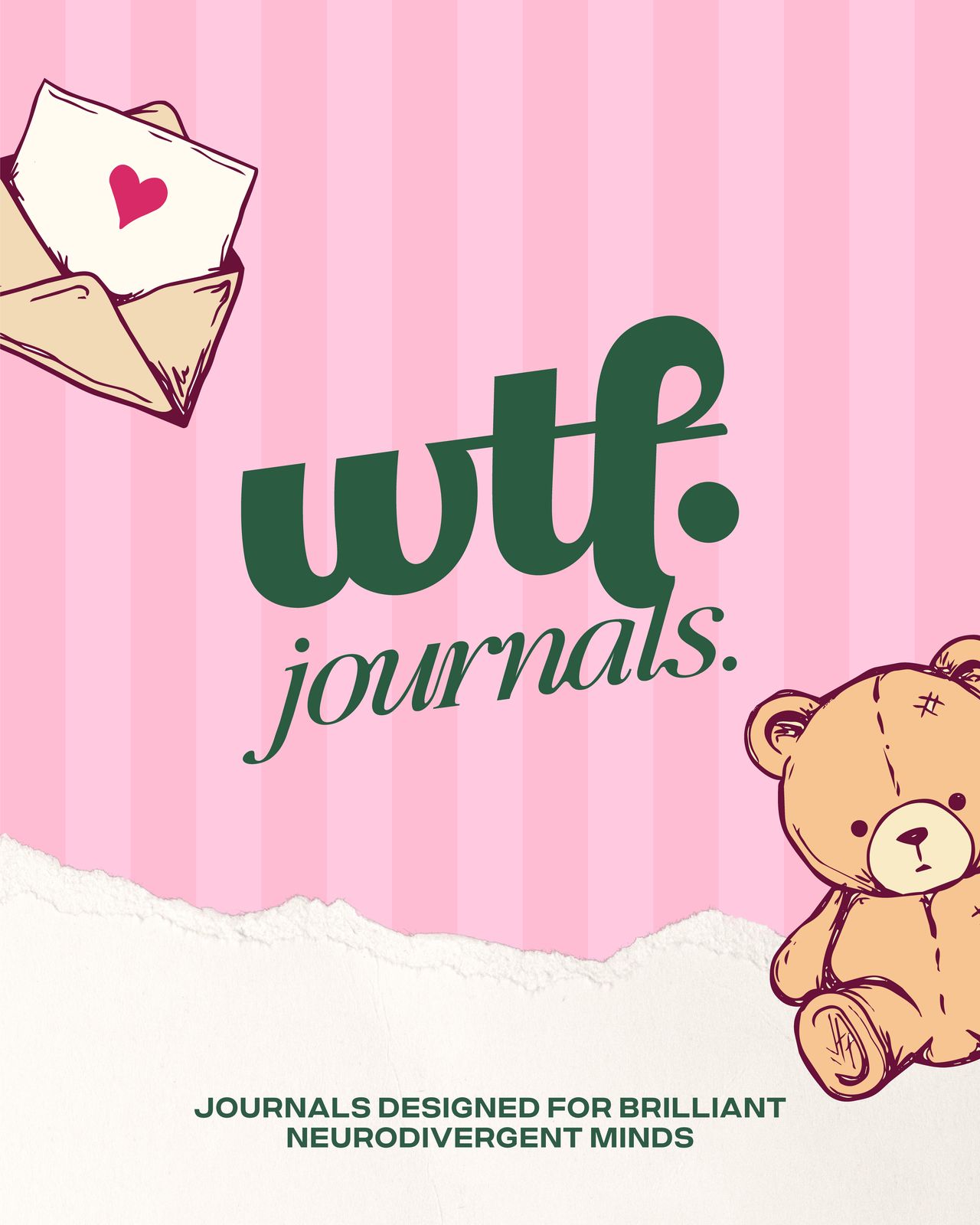
We kept wtf from the podcast for instant recognition, but set it in a soft, high-contrast serif with a weighted full stop so it reads as a product brand rather than a show. Around it sits a modular kit - stripes, torn paper, hand-drawn stickers, message bubbles - that behaves like the journal itself. Pieces you rearrange depending on what you need that month.

Why did we design it this way?
The wordmark. A rounded serif with a weighted full stop. Familiar enough that the existing audience clocks it instantly, quiet enough to sit on a product someone paid real money for.
Colour. Deep forest green anchors everything, with pink for warmth. The green is the decision that matters - it stops the palette reading as default-feminine and gives the brand somewhere grown-up to stand. And because the community chose it, it arrived already belonging to them.
Illustration. A teddy, an envelope, a butterfly, torn paper edges - used sparingly and kept to the margins. Softness without infantilising the person holding it.
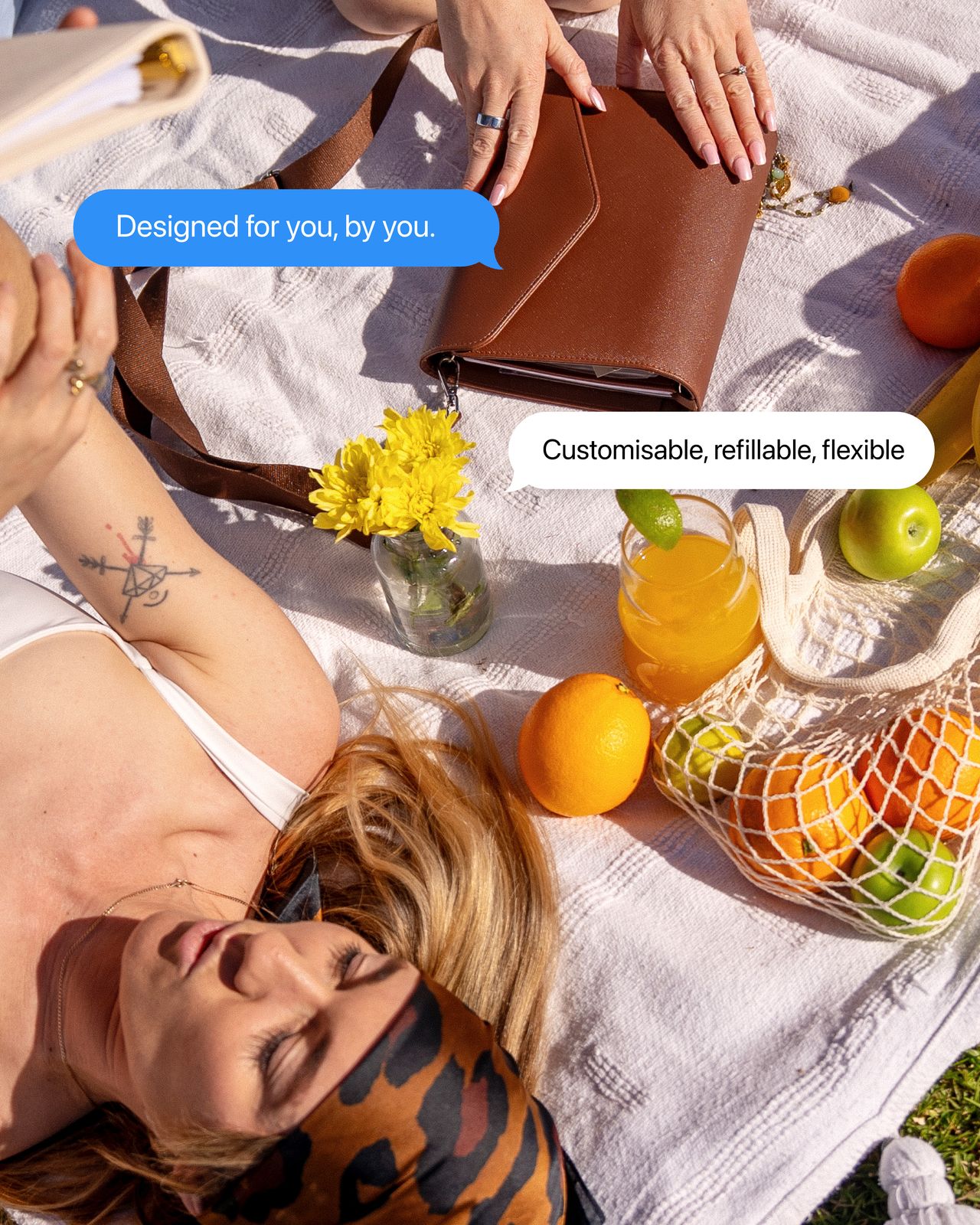
Message bubbles. Campaign imagery answers questions in the format people already read them in. Designed for you, by you. Customisable, refillable, flexible. It does the explaining in the two seconds a scroll allows.
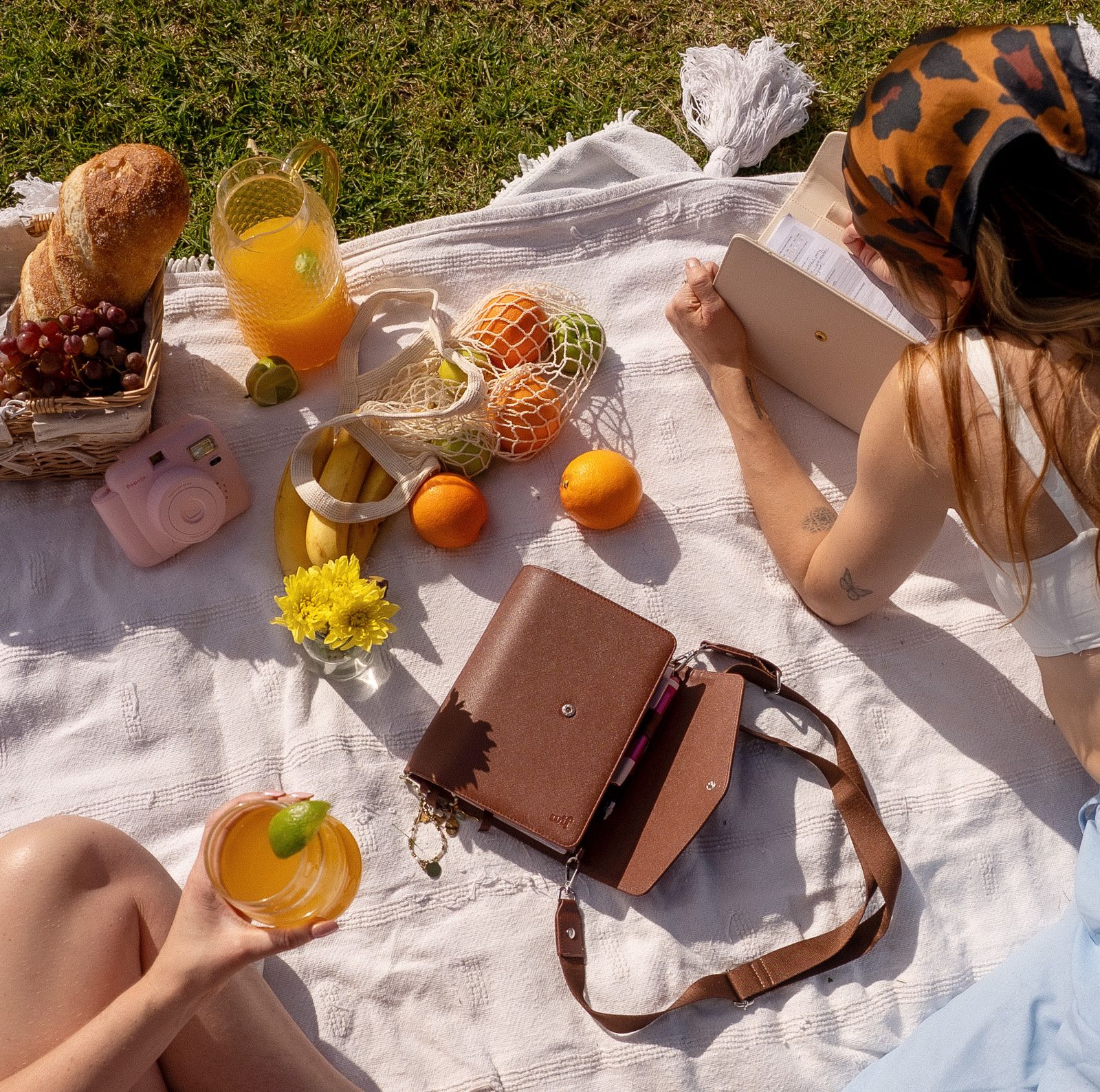
Photography. Sunlit, lived-in, out in the world - a journal at a picnic rather than a flat lay on a desk. The product is meant to come with you, so the imagery had to show it doing that.
A product brand, not merch. The identity keeps enough of the original to be recognised, but is built to sell a physical product to someone who has never heard the podcast - which is where the growth actually is.
Made a structural difference legible. Undated, flexible, guilt-free is almost impossible to photograph. The messaging system says it plainly, in the founders’ own voice, at browsing speed.
Built for a launch and everything after it. Templates for the founding member campaign, giveaways and pre-order mean each drop looks like the same brand without a designer in the loop.
The result
WTF Journals opens for pre-order on 17 August with an identity that looks like the product deserves, and a community that has been part of it since the first question was asked. One comment on the palette vote put it better than a strategy deck could: literally by the people, for the people.
The system also leaves room to grow. Nothing is tied to a single product, so the next thing they make already has somewhere to live.